DocuMine
DataSnipper's first AI product, from scratch.
From learnings on a failed attempt to deploy AI to DataSnipper's existing product suite, the Innovation Team were hunting for the next problem to solve. We found it in the format of DocuMine, a solution to long complex document extractions.
Role: Lead Designer
Team: PM, EM, 5 Full Stack, 3 Machine Learning Developers
Duration: 18 Months
Document AI
DataSnipper's first foray into AI implementation didn't fare so well.
We were following the trend of chat interfaces thrown carelessly into existing products at the expense of users and time. After time spent developing our MVP of Document AI, we called a meeting to layout what it would take to bring the product to market.
From bugs, usage limits and forceful user interactions it was clear this was not what our users needed. There was no evidence of saving time and use-cases too closely overlapped existing products.
Document AI was iceboxed.
DataSnipper AI Product Principles
When conducting a post-mortem of Document AI, we concluded that we were building without direction and grounding to DataSnipper's original vision. After pacing the room for a while, we developed our AI Product Principles to guide our next efforts.
Traceable
It must always lead back to the source.
Actionable
Users must be able to work with the output.
Supportive
The product must exist where the user is already.
Specific
It has to be the right tool for the job.
Solving the right problems
After a thorough review of what went wrong the first time, we settled on three problem areas:
Document Knowledge
Users don't have entire knowledge of their documents.
Speed
Users need a solution faster than 'Search + Snip', that scales.
Repitition
It's not just 1 Question for 1 Document. It's Multiple Q's across Multiple Docs.
How might we quickly answer repeated questions across documents, regardless of format?
Proof of Concept
With our team given the freedom to work on our own discovery, we posed the problem and our question to the EM (Employee No.4). They went away over a weekend and returned with a proof of concept.
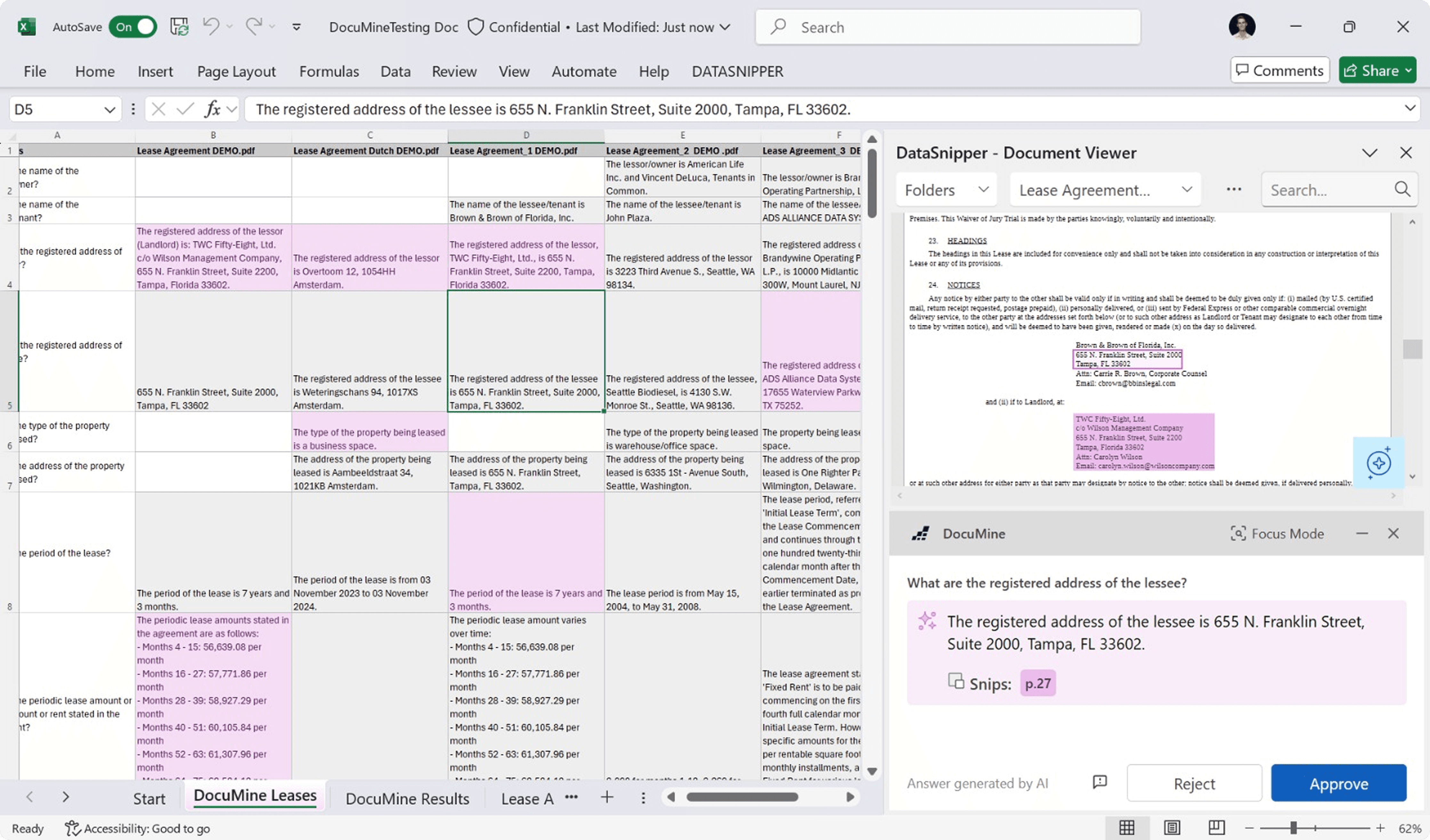
Questions in Column A, cross matched to all available documents then spitting out answers in a matrix format. When we saw this, we knew this was the direction we needed to take.
It was then up to us to make this a usable part of DataSnipper's ecosystem.
MVP
After the green light from management, we introduced the concept to the rest of the team. They would be making a stable version using WPF and DataSnipper's existing codebase. I would be working a sprint ahead of them to make the deadline at the end of the year. For me, the product was split into three focus areas;
Setup
This would be the easier one. DataSnipper uses a variation of Fluent and had an extensive component library.
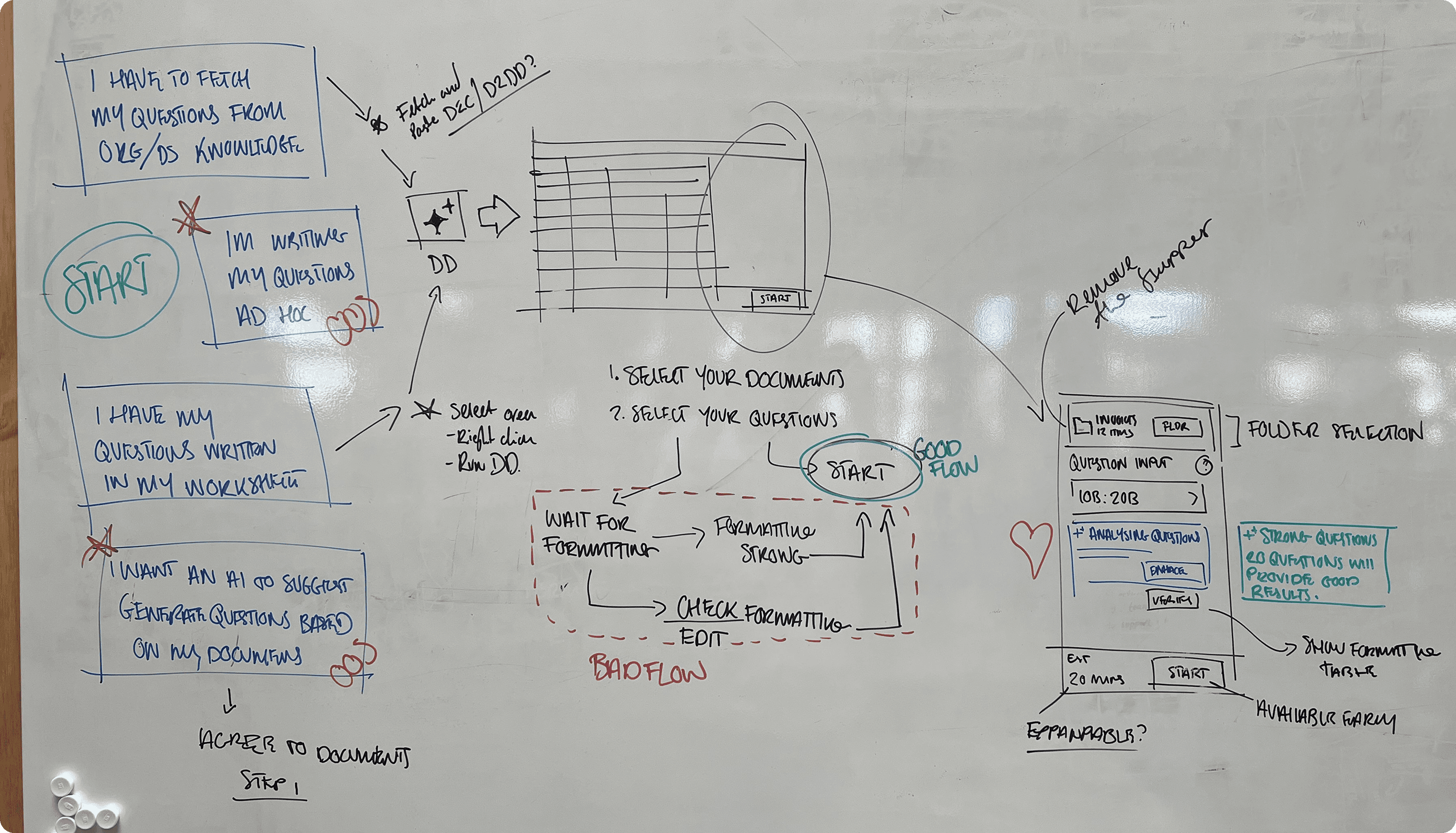
Following the same flow as Document Matching was the obvious choice, the main difference would be the steps:
Select your questions, 2. Select your documents, 3. Verify your formatting (what snips would be used for an answer).
Matrix
Early on we established from research it would not be enough to just present users with AI Answer. This decision evolved into our actionable principle. Each answer, the user was given the choice to 'approve' or 'reject' the snip backed answer to make a choice.
The Answer Matrix needed to reflect the actioned and unactioned answers through design.
Purple border = Unactioned.
Answer Card
Auditors need as much information as possible to form an opinion, we needed a way to give them everything the AI had produced.
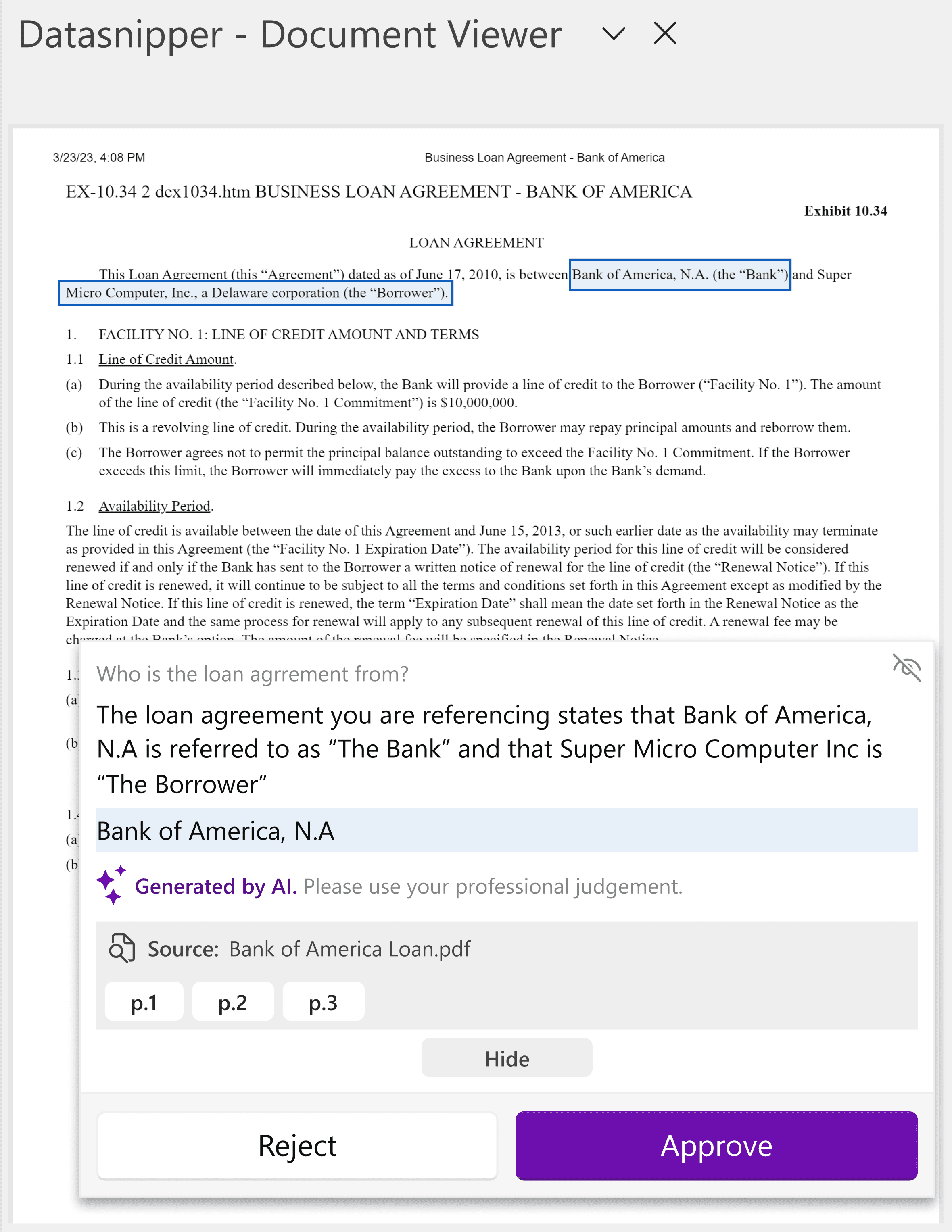
This came through the idea of an Answer Card. Sitting in the bottom right of the Document Viewer, it would display the question, AI explanation and the snipped answer. All a user needed to do was approve or reject it without having to leave the Document Viewer.

Testing
With working so closely I was able to perform user testing on a stable version of the MVP. A test version was sent to a few select clients, whilst we also undertook in-person testing with our ex-auditors at DataSnipper.
Feedback
"I don't understand this answer?"
It wasn't always clear where the answer was coming from. Snips could be placed seemingly randomly.
"What's the difference?"
The AI had a tendency to repeat itself for Answers and Explanations. This confused the users who then began to mistrust the AI Answers.
"Too much colour!"
The matrix used DataSnipper's existing Snips, however paired with our AI Purple, this led to a complex and overwhelming worksheet being presented.
This feedback was not the results we were hoping for, but it was not damning yet. Every user questioned agreed that there was value in the product, they could see the underlying idea and time-savings.
We would need to go back to the drawing board for production.
WPF vs React
With the later delivery time we made the decision to move to React for production. We had struggled with transforming outdated WPF components for our users. Paired with the need to communicate to a server with each answer interaction it was time to bring React to DataSnipper.
Reducing Complexity
After agreeing with management that we needed to move delivery, we set about fixing the feedback received. I focused on the product side as developers worked on bug bashing.
AI Identifiers
In the MVP we'd followed the trend of making AI purple. This backfired when we saw users getting confused with Table Snip. I sat with Marketing to design our new AI identity as well as pushing for Primary Blue to be updated across products. AI Pink would be reserved exclusively for AI Generated content.
Upgrading the Matrix
By introducing this pink, it became simple reducing the strain on the user when arriving at the answer matrix. All answers would be displayed as grey when unactioned, then when a user approves the cells turn pink. When a answer is rejected the content is removed. At scale this colour and removal system allows for a more scannable document.
Speed & Focus
It was very evident that users were struggling with context switching between their answer cells and verifying the documented snips. The WPF built Answer Card overlaid on the document and required fiddly animations and state changes to view just the document. Paired with the speed at which auditors usually work through Excel using keyboard shortcuts, our mouse movements were slowing them down.
Answer Card
Now free of WPF, I was able to design the Answer Card with more responsive design elements and states. Moving from a overlaid card to a separate window allowed for users to view it more as it's own entity rather than the DS equivalent of Clippy.
Responsive design meant more room for different features at scale as well as custom movement from users. Toasters, options and edits were now all included in one location.
Focus Mode
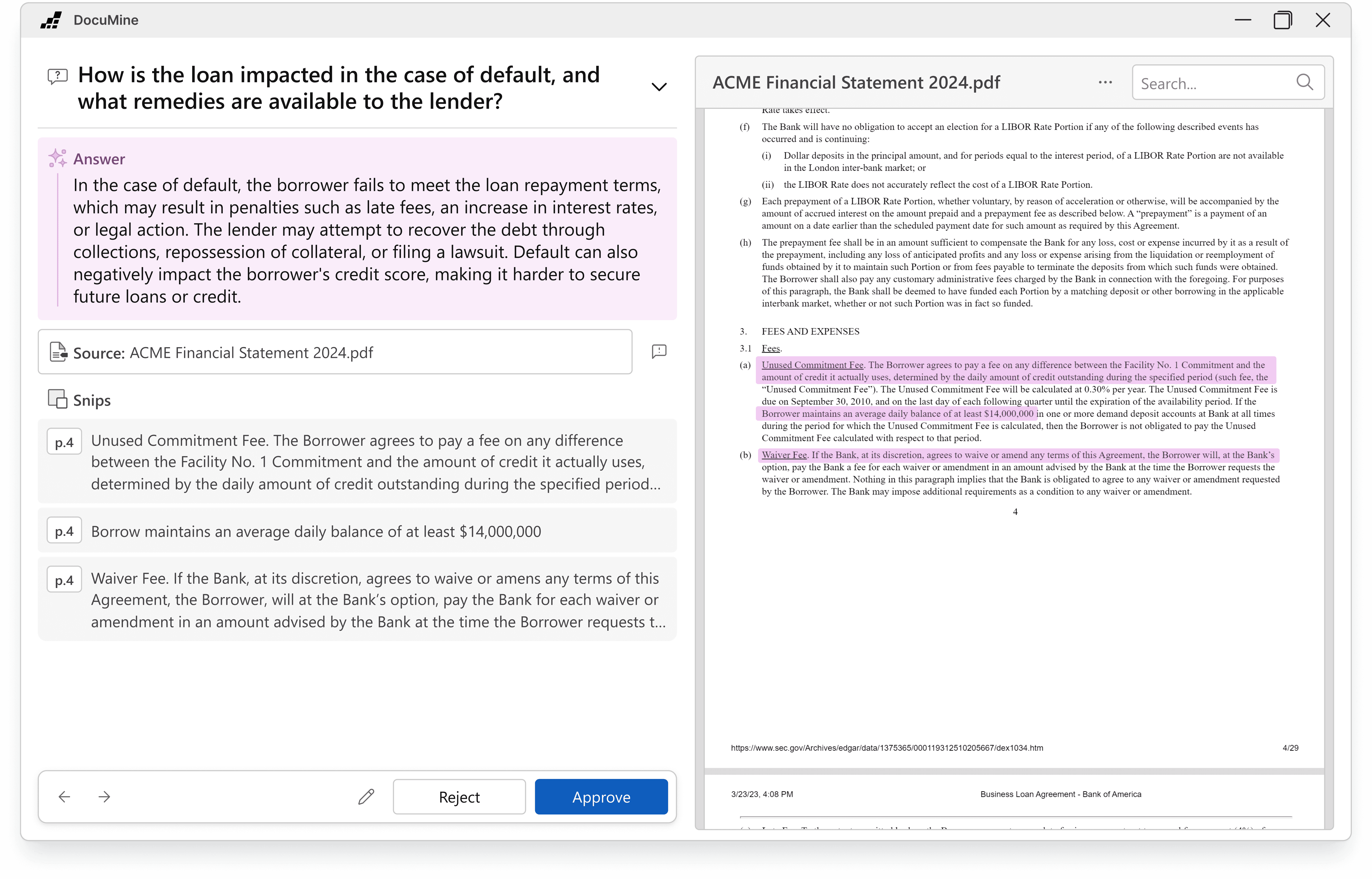
The largest feature included. After listening to the feedback that users were overloaded with information from the answer matrix, we needed a way to allow users to navigate answer by answer.
At first I designed this in the Answer Card, but when the size constraints became too much we needed to introduce a new window. Focus Mode allows users to view one document, one answer and all related information at a time. Cycling through either a question or a document at a time they only see what they need to see to review and make a judgement.

Testing
Limited Availability
Roughly a month before launch we provided keys to early access users with free usage limits. We held weekly interviews to see how they were performing with the product and any issues relating to deployment. A POC fed back to us any new use-cases as we built up an question library for launch.
Client Visits
A small group of us went to London for client focus groups with 5 major partners. They were given a mostly-production ready version and a series of tasks. We observed the behaviour and then hosted a round table afterwards.
Outcomes
94% Approval rate
1:16mins Avg. launch time
2000+ Early Access Users
Notes:
Learn the tech stack faster
WPF is not an easy environment for development. It took a lot of time between myself and the developers to learn what was and wasn't possible. Learning this earlier on would have solved a lot of problems down the line.
Have faith in Focus Mode
When my PM pitched Focus Mode to me it took me a while to get my head around it. I believed our users would be too stuck in their ways to leave Excel. It wasn't until reviewing the usage logs and the London site visits that the overwhelming positive feedback turned me.


